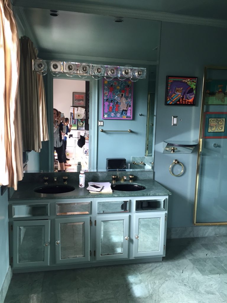
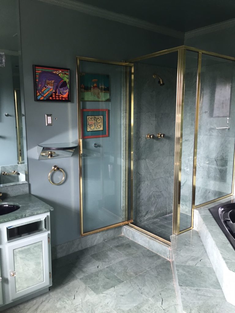
Max’s bathroom was not meant for a teenage boy on the cusp of manhood. All mirrors and brass, it was a little too old-Vegas for a brilliant, sweet, inspired young man.
So we set out to create something sophisticated and serene with graphic elements that tie-in better with his bedroom.
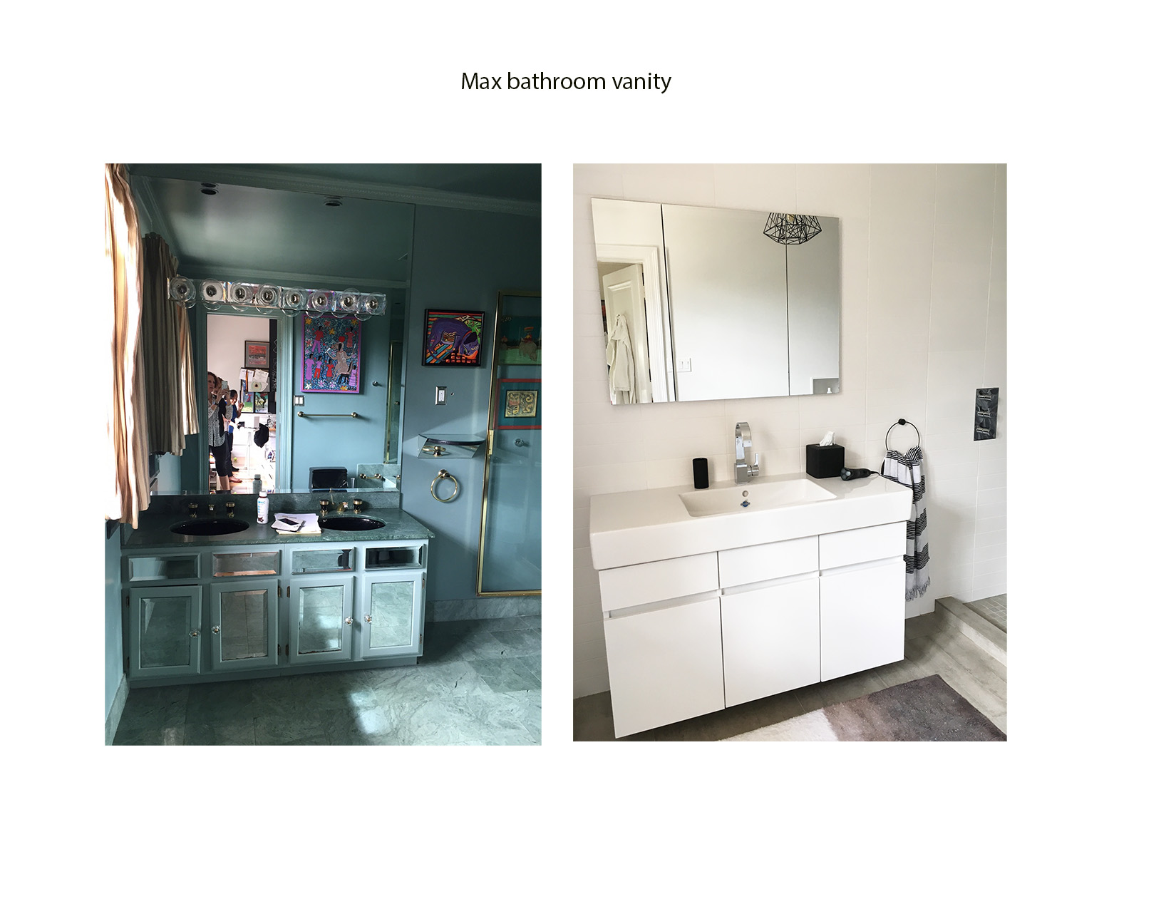
The old vanity wall.
Renovated vanity wall. We added a modern vanity and chic accessories. Elongated white ceramic tile for the vanity wall. And striped curtains from The Shade Store, balance the graphic elements.
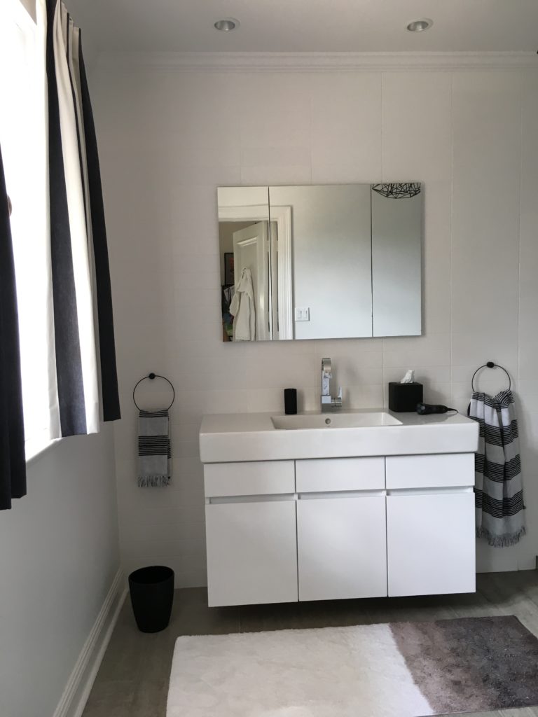
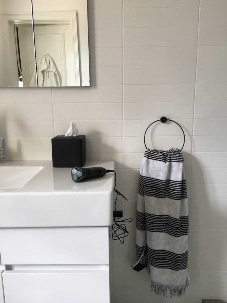
Duravit vanity and sink. Ferm Living towel holders and towels from Target.
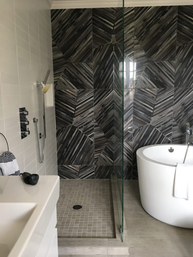
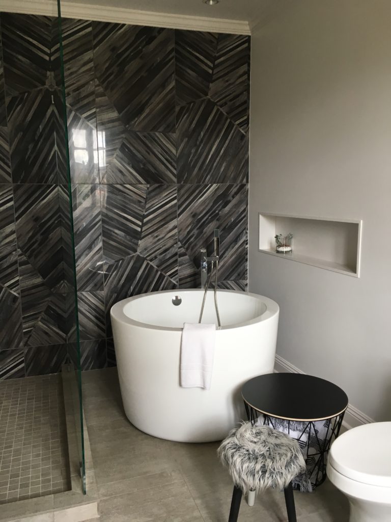
A wall of large graphic tiles, but with a softness and texture. Masculine but whimsical. Walk-in shower.
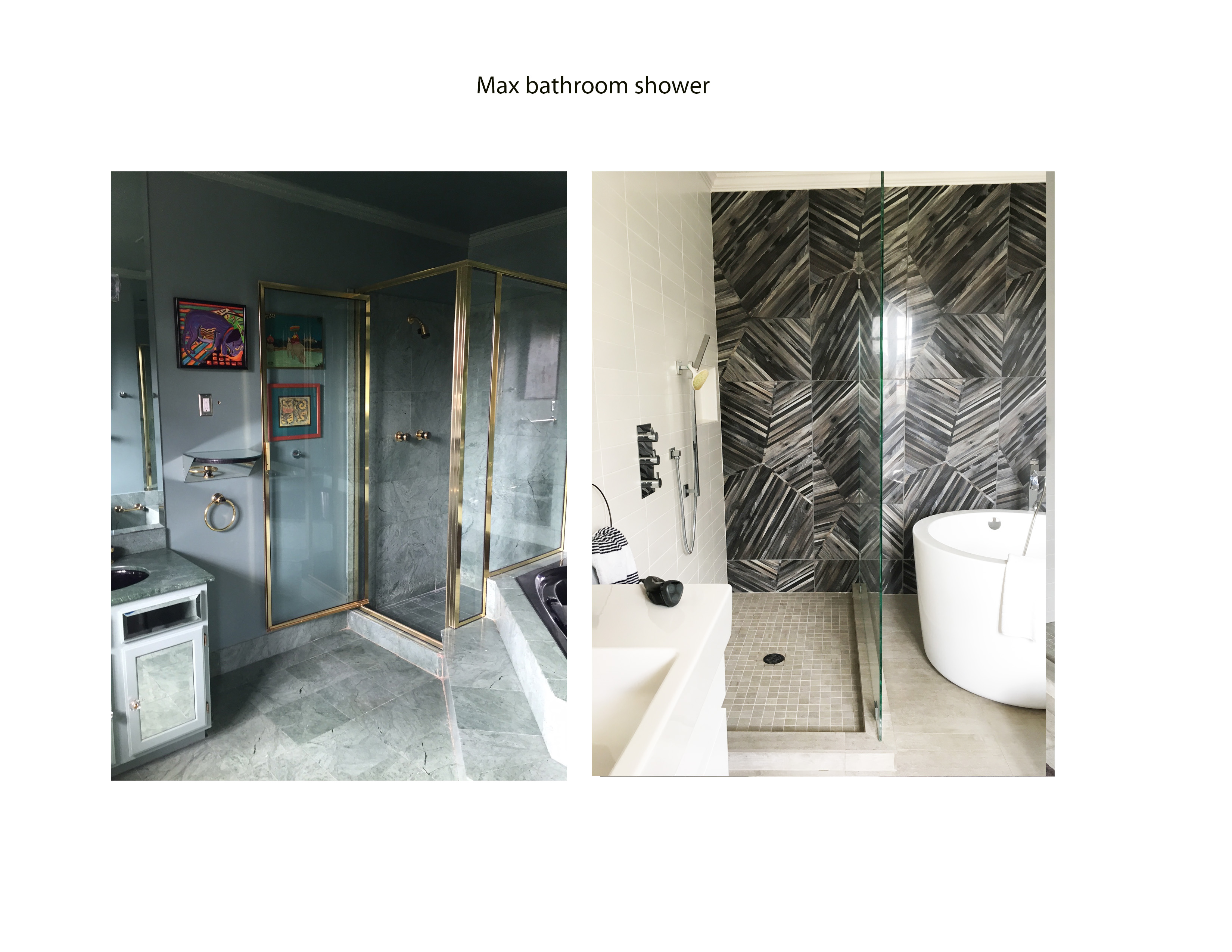
The shower before.
New shower with warm ceramic tile, seamless glass walls with an open end. The new bathroom floor has porcelain Utah tile that looks like cement. It gives the room more warmth and blends well with the wall tile. Highlighting it’s warmth and mixing patterns.

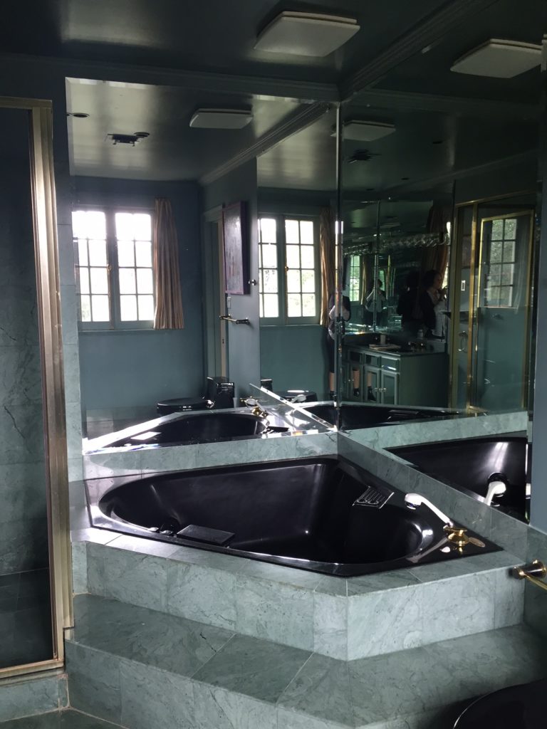
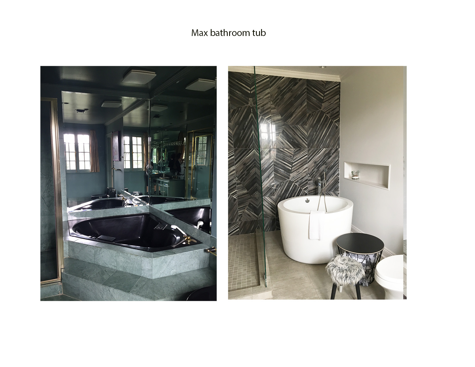
The old tub with wall mirror surround was never used. And Max is actually a tub guy!
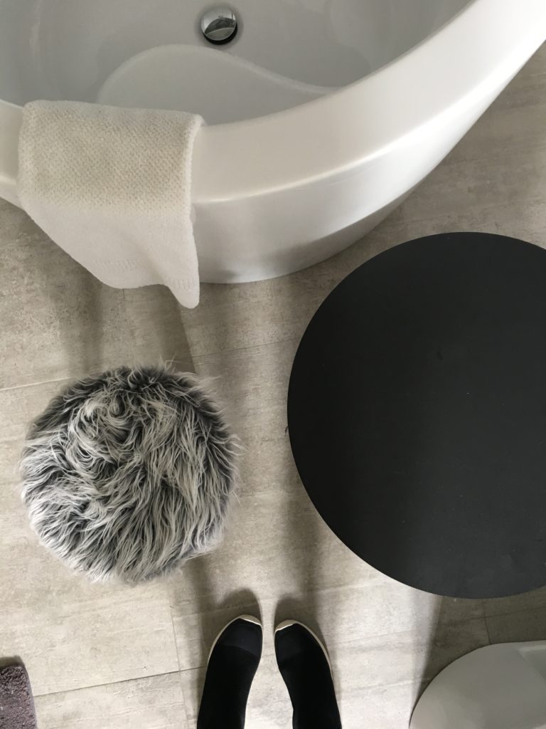
So we added a Japanese style soaker tub with floor mount tub filler and lighted niche for supplies and display. The towel holder table is from Ferm Living.
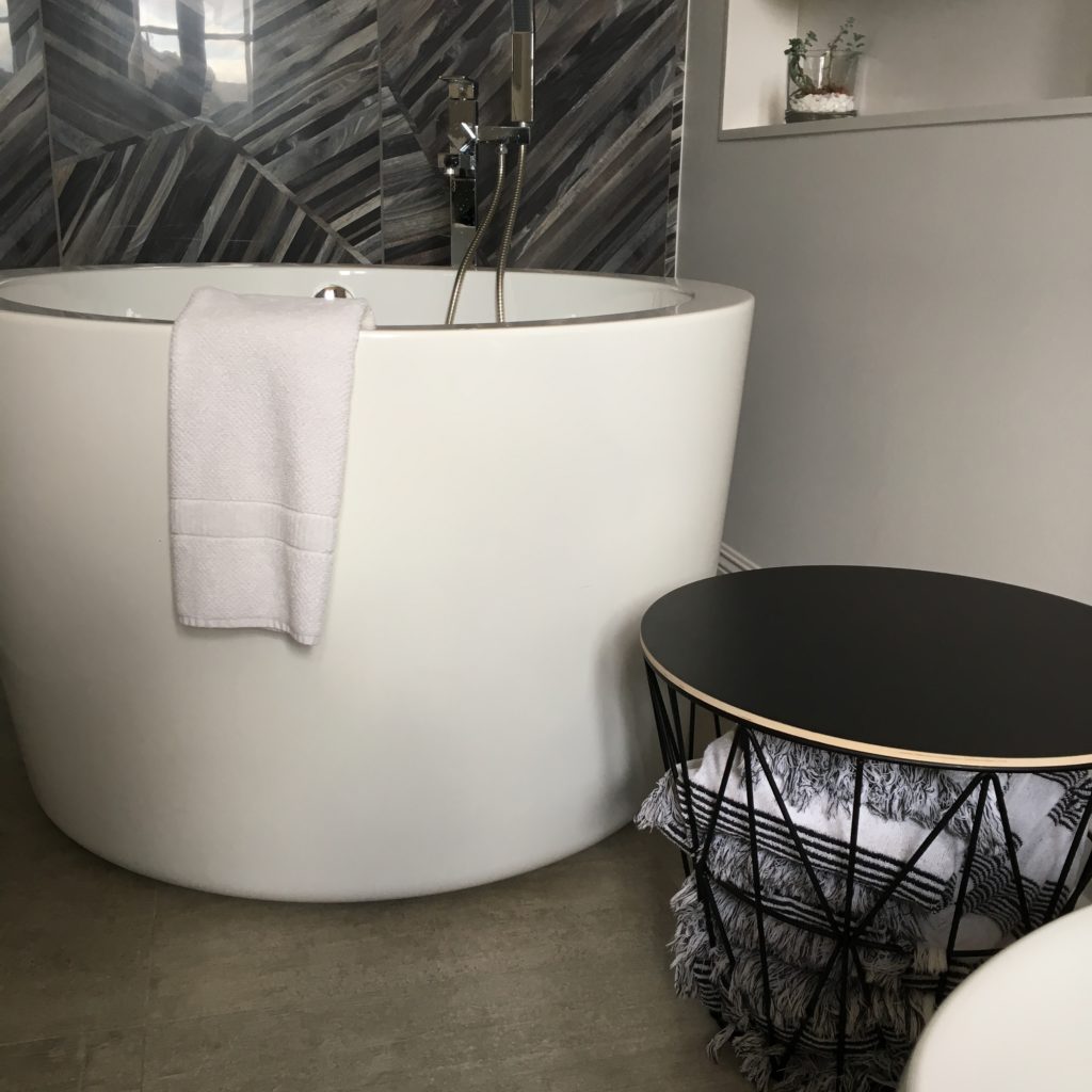
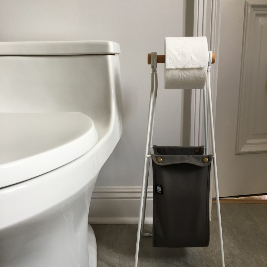
New toilet to replace the old black one and cool Sling toilet paper holder from All Modern.
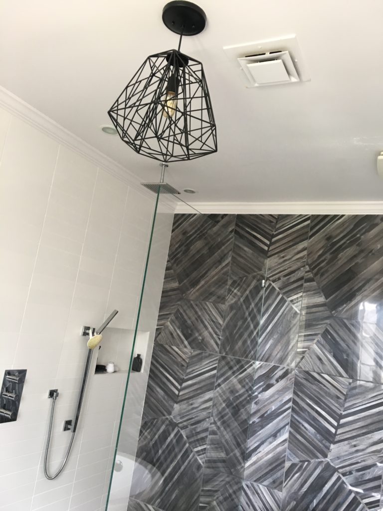
Love the light fixture from All Modern. It balances the lines of the wall tile and the towel side table.
Furry stool adds some texture.
Her are some side by side before and afters to see the amazing transformation.
GO BACK

Comments